Choosing a color palette for interior design is probably the thing I get asked the most about. And it is quite understandable since the harmony of a color palette prevails to give style to an interior. Deciding on a color palette should always be one of the first steps you take when redecorating a room. It’s going to help you decide what furniture you should get and the kind of ambiance you want the room to feel like. It will also give you a thread that will help you keep things consistent throughout the whole process.
Table of Contents
- A note on picking a color palette for a rental
- 1. Take into account the existing elements
- 2. Go on a pinning spree
- 3. Think about how you want the room to feel like
- 4. Pick 3 to 5 colors
- 5. Choose 2 colors as your key colors
- 6. Complementary colors (accent)
- Ready to see it in action?
A note on picking a color palette for a rental
Of course, when you rent your apartment, you have to do with the existing one. A certain color of tiles, a particular wall color, or a shade of hardwood floor, could change what you had in mind in the first place. Nevertheless, you have two options. Either you try to work with the existing or you try to hide it with temporary solutions. For example, I had a tile on my kitchen floor that I would have never chosen myself. But, after a little consideration, I decided that I didn’t hate it and that it could even be a statement piece. So I worked with it and included it in my color palette. On the other hand, I had existing kitchen cabinets that were painted in a really dull shade of white. So I decided to repaint them.
In the end, the whole idea is to spot the existing decor element that could be an asset to your project. Sometimes there is none and that’s okay, there is plenty of solutions out there to hide bad flooring or a terrible backsplash.
So the first step when you work on a color palette for your interior should be to:
1. Take into account the existing elements
This step doesn’t have to be annoying, sometimes it can even be inspiring. When you have key features such as a green marble fireplace or a beautiful herringbone hardwood floor, chances are that you’ll take these as the starting point of your color palette rather than hiding them. So think of the existing features you want to keep and take pictures of them.
At this point, you should also think of the furniture pieces that you already own and that you want to use in this particular room. Because these will also have an impact on your color palette. For instance, I own 4 black chairs with copper legs that I knew I wanted to bring in my new rental so I took it into account and copper became an accent color in my palette.
2. Go on a pinning spree
Now, time for the fun part! Create a Pinterest board and start by uploading pictures of the existing elements (see step 1) if you have some. Then pin whatever speaks to you visually. Don’t restrain yourself to only interior decor pictures, instead pin anything that you like. It may be an outfit, a painting, or even a picture of food. The idea here is to really cast a wide net of the aesthetic you like. Don’t think too much about it, just pin! After that, you should see a pattern emerging. Do you notice any recurrence in terms of color? Take notes of what you see.
Check out the Pinterest board that helped me build my interior color palette.
3. Think about how you want the room to feel like
If you have too many colors and have trouble seeing a pattern emerging, it’s always good to ask yourself: ” What do I want to feel when I enter this room? If the answer is calm, tranquility, or zen, try to keep it low-key and avoid bright colors, they have a tendency to excite people.
This step is here to help you narrow down the pictures on your Pinterest board.
4. Pick 3 to 5 colors
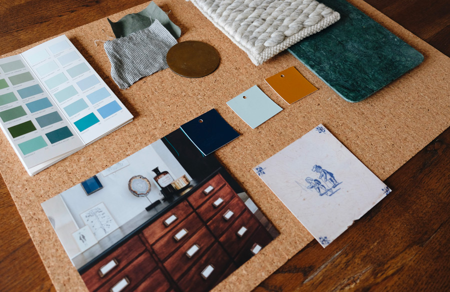
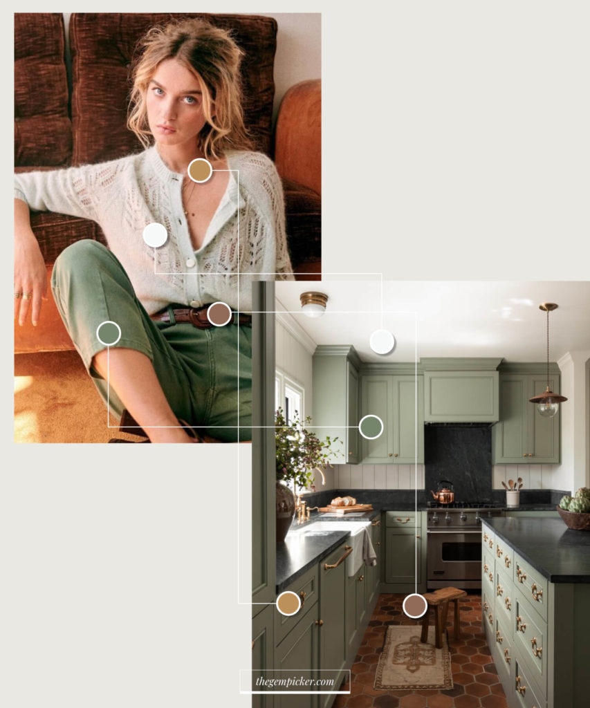
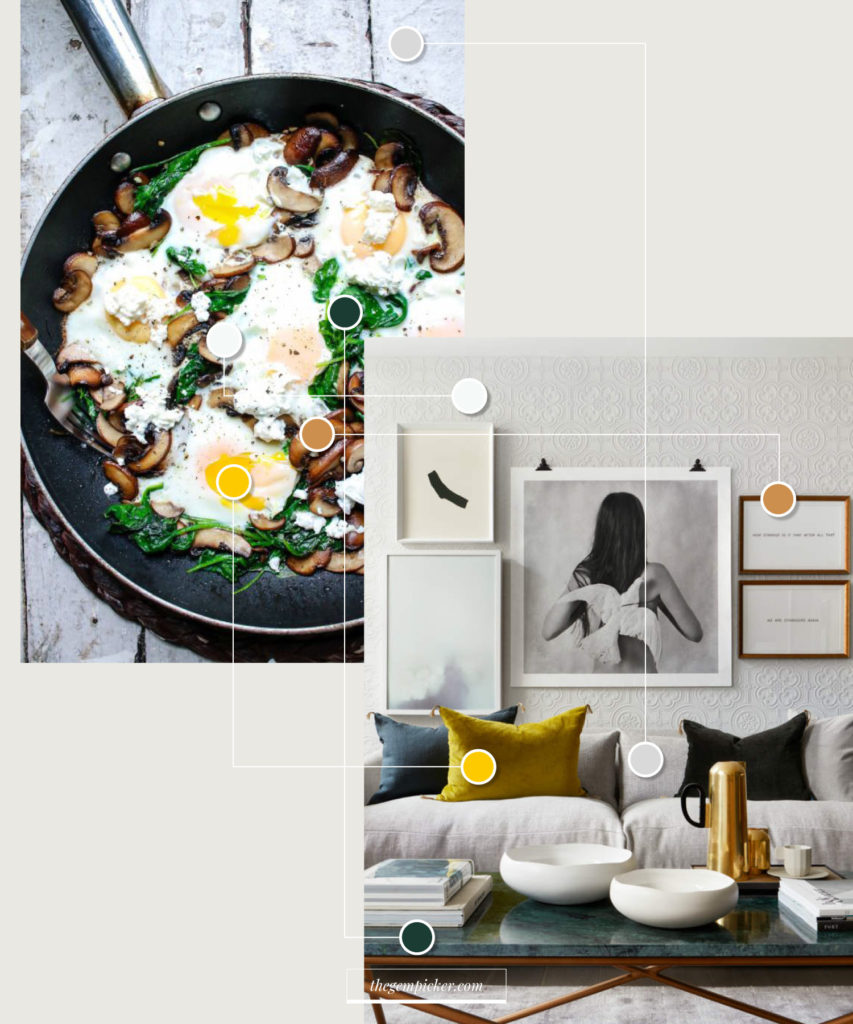
Working with 3 to 5 colors is a good amount to keep things interesting and coherent in a room. Less than 3 can feel a little matchy-matchy, while more than 5 can be overwhelming. But don’t worry you can play with shades of these 3 to 5 colors. So, in order to actually pick these colors, start with a picture you pinned on your Pinterest board. Choose one that represents the general atmosphere of your board well. It can be an actual interior picture but not necessarily. A picture of a painting or floor tiles or even a picture of a meal can work (see the image below).
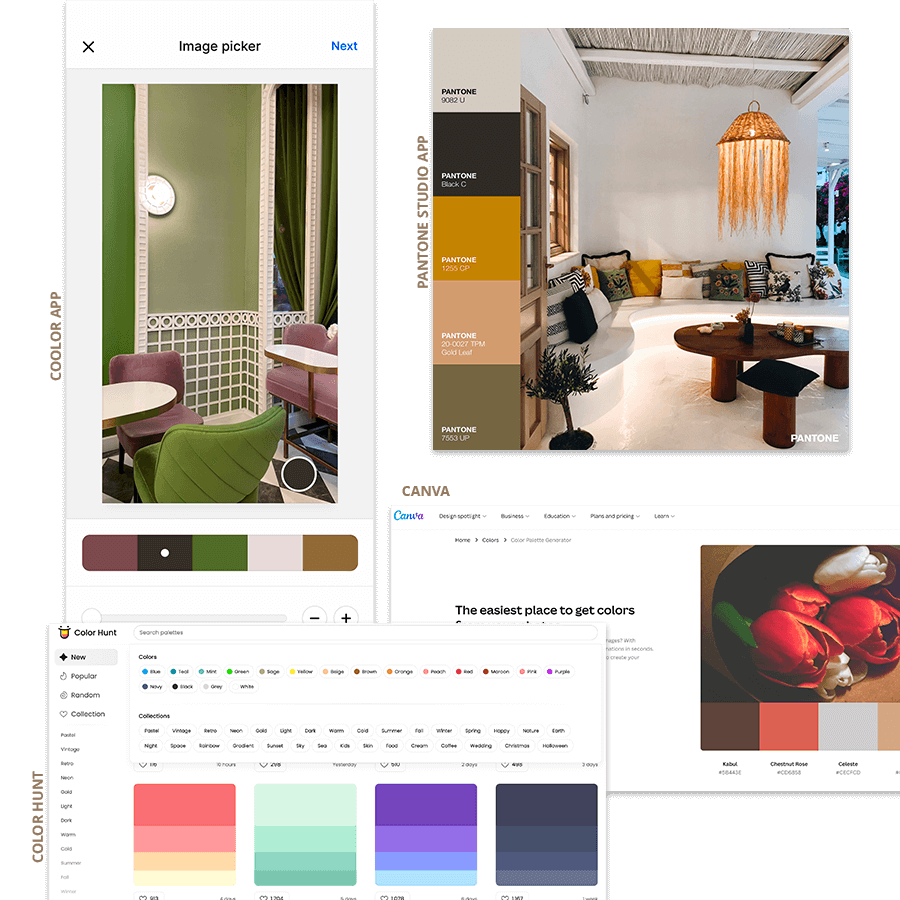
color palette generators for interior design:
- Coolors app : Probably the best and most powerful way to select your color palette. You can easily pick colors from a picture on your phone. The app will preselect 5 colors for you but you can play around to see what works best. Or simply browse the app’s library with thousand of color palettes created by other app users.
- Pantone app: Same with the Pantone app. You can easily change the colors the app has preselected.
- Canva: has now developed an easy and quick tool to extract colors from your photos. Only, you can not select the color of the picture you want to select. Canva will decide for you which colors to add to your palette.
- Color hunt: Color hunt has a nice library of colors. You need to submit your color palette before it’s published on their website which ensures a certain quality. Also, their search tool is pretty useful as you can search palettes by colors just like the picture below :
N.B. When you pick your colors, focus on finding a good balance. For example, if you have lots of warm tones (shades of red, orange, yellow, pink) try to counterbalance them with a cooler one (a shade of blue, green, purple, grey).
5. Choose 2 colors as your key colors
Once you have your 3 to 5 colors, decide which ones you want to use as your key colors. The key colors are the most visible in your layout. Often key colors are neutrals but not necessarily. It also depends on the style you want to infuse in your room. If you are more of a minimalist and like things airy and bright, then your key colors might be shades of white, grey, or beige. If you are a bit bolder, It might be a dark green, a warm orange, or a cool blue.
6. Complementary colors (accent)
These remaining colors are the ones you play with. Most of the time you find them in accessories, smaller pieces of furniture, home textile, etc. These colors are meant to bring the room to life by binding everything together. If you chose neutrals as your key colors, this is where you bring little pops of colors.
Ready to see it in action?
Building a color palette is less about having a perfect eye and more about having a method. Start with what you can’t change, identify what genuinely speaks to you, then narrow down to 3 to 5 colors with a clear hierarchy. Once you have that, every sourcing decision gets easier. If you want to see how this applies to real interiors, I break down specific homes and exactly why their palette works in this series of articles.
In the meantime, let’s see examples of color palettes applied to interiors that work well.
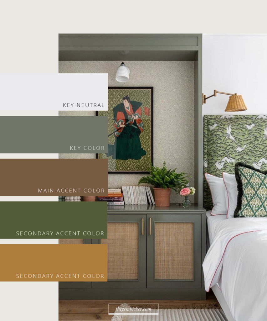
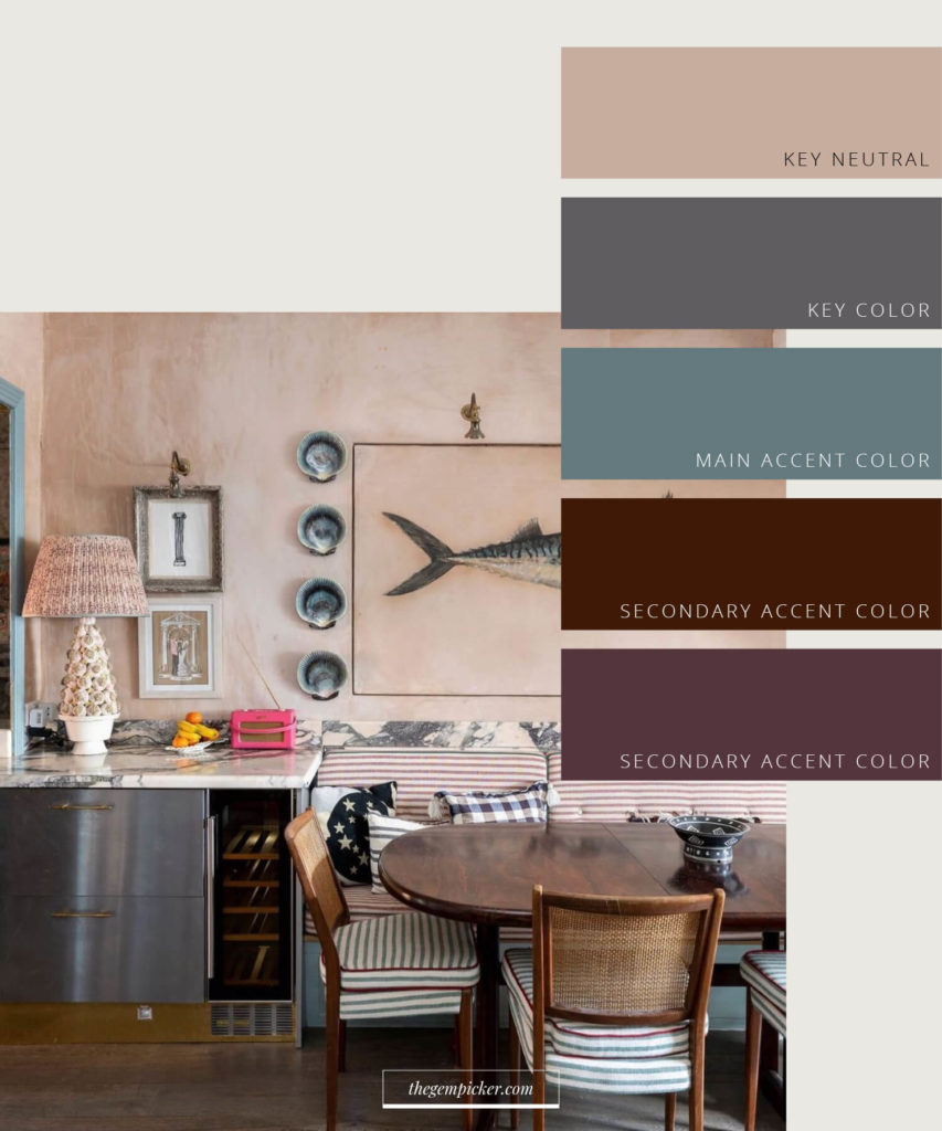
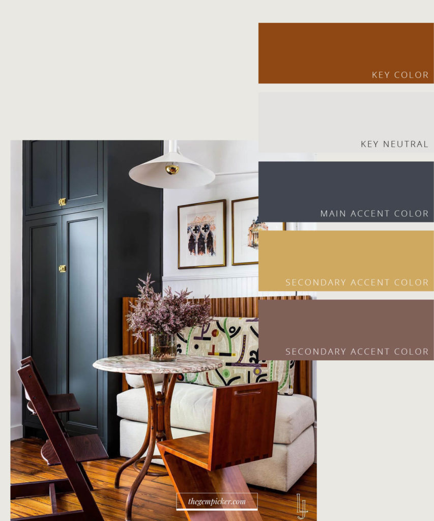
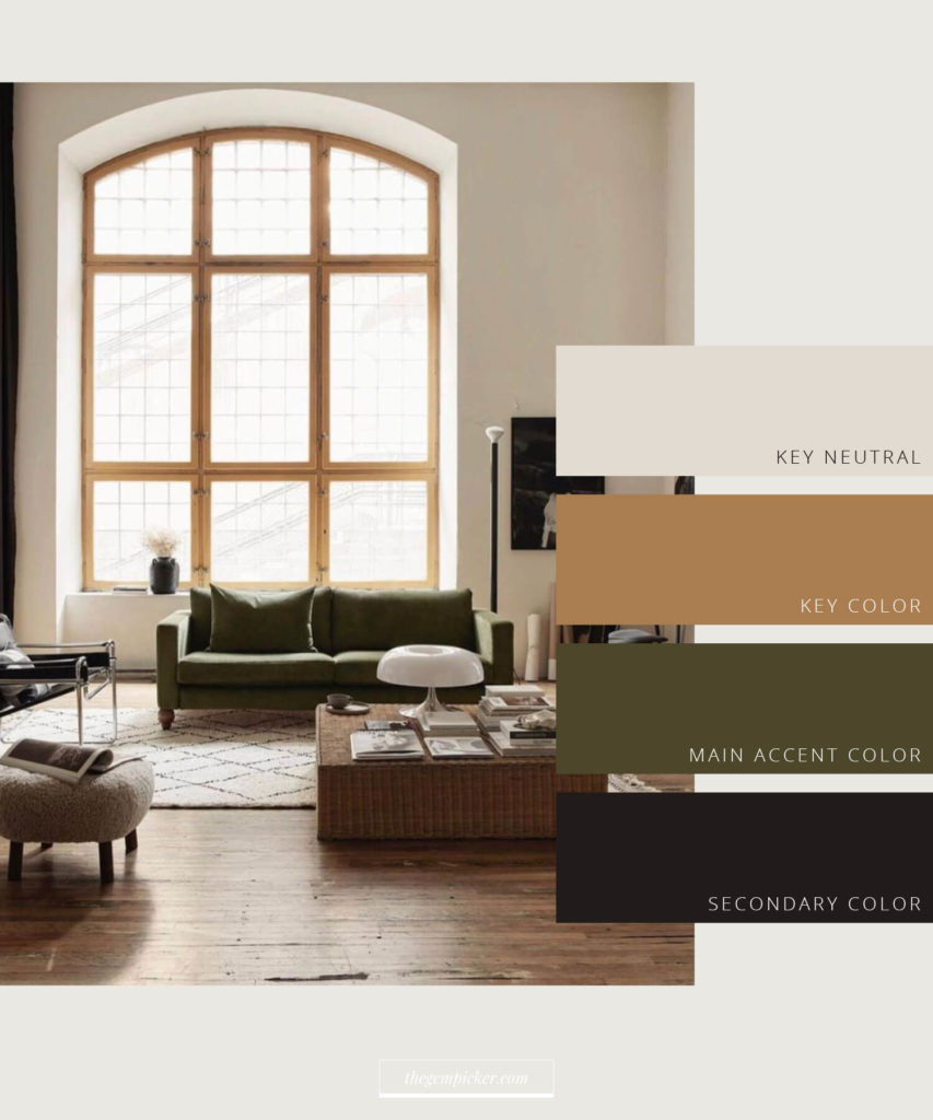
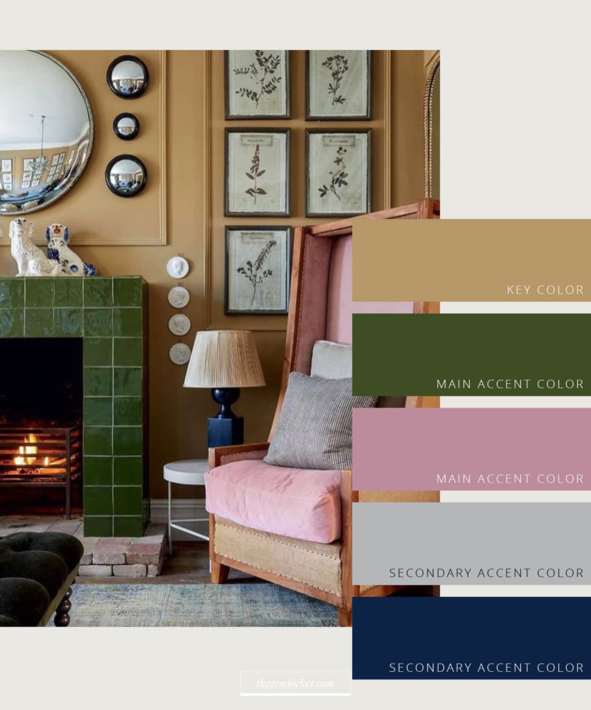
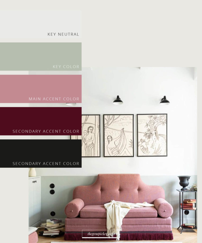
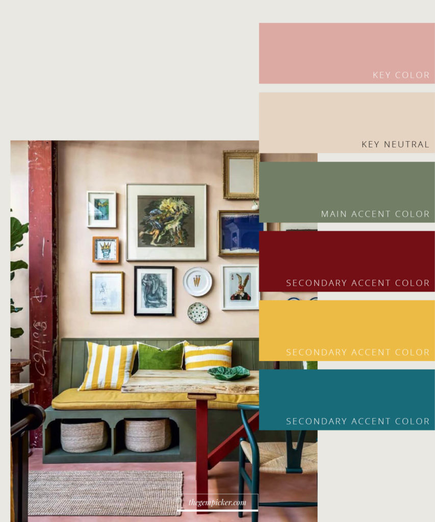
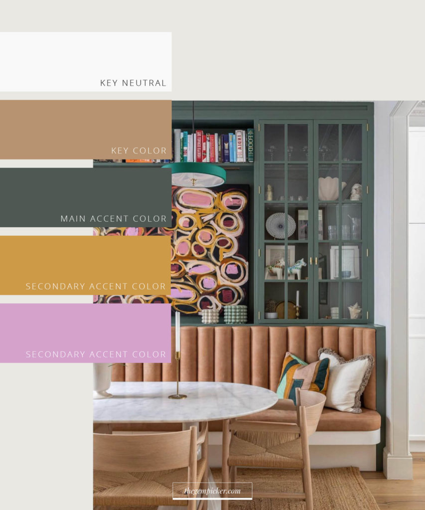
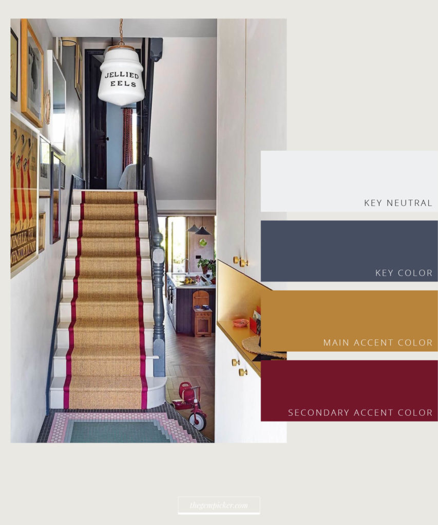
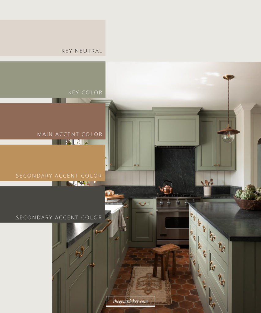
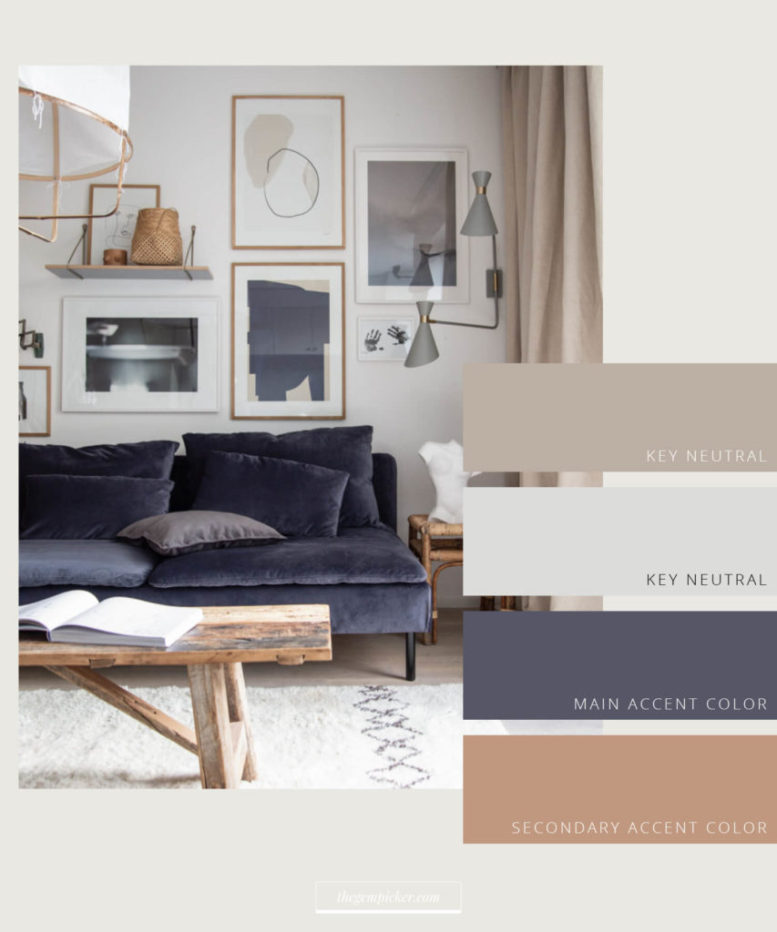
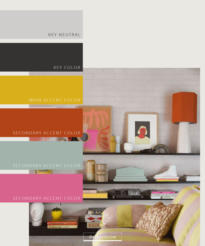
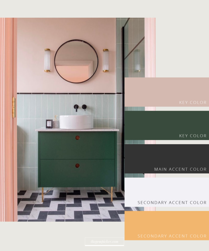
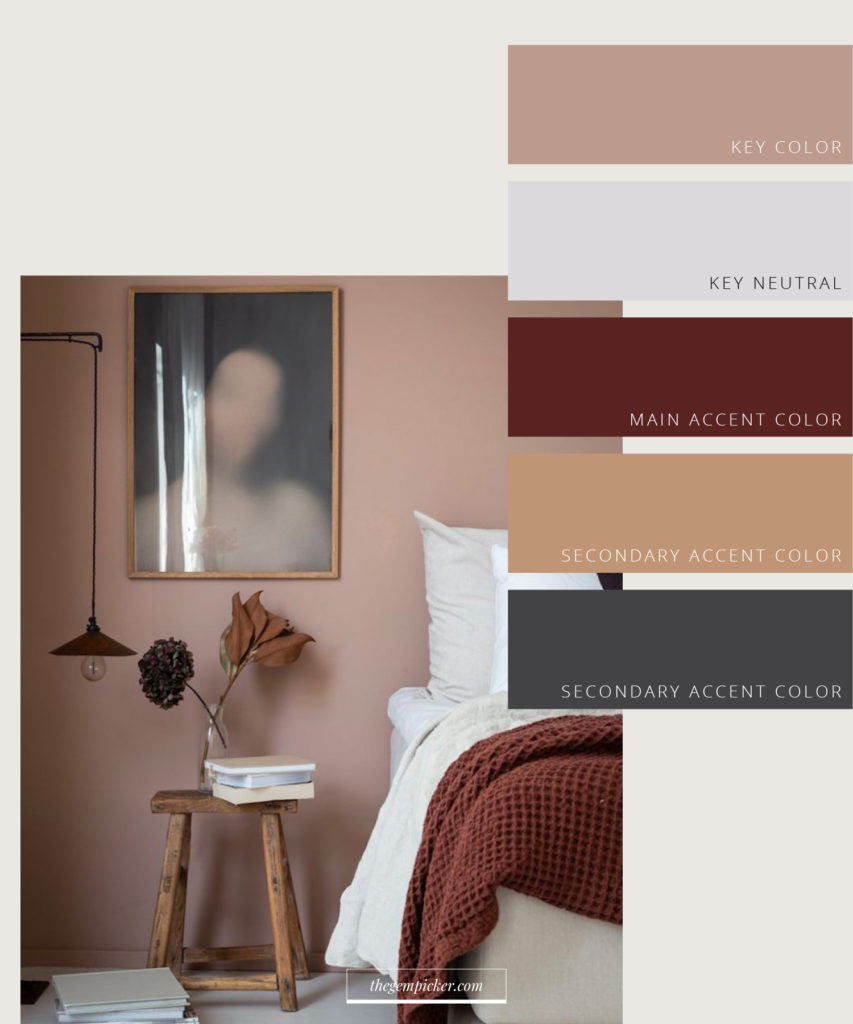
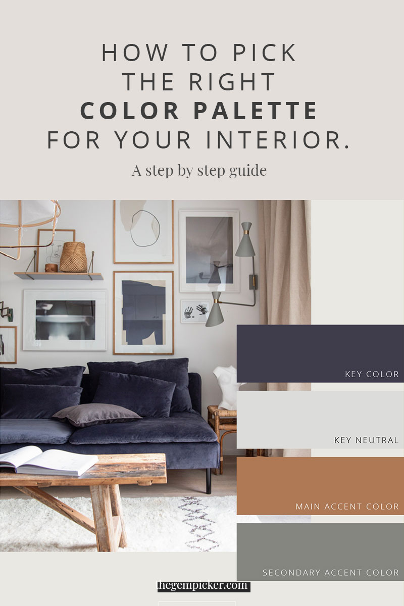
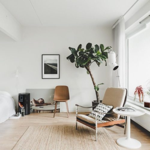
Here, I’ve tried to cover every possibility in terms of key colors. Such as a neutral and a color as key colors, two neutrals as key colors, and two colors as key colors to show you that everything is possible. Also, you’ll see that most of the time there are 5 colors in the palettes below but it is possible to have fewer or more but the more you have the trickier it gets.

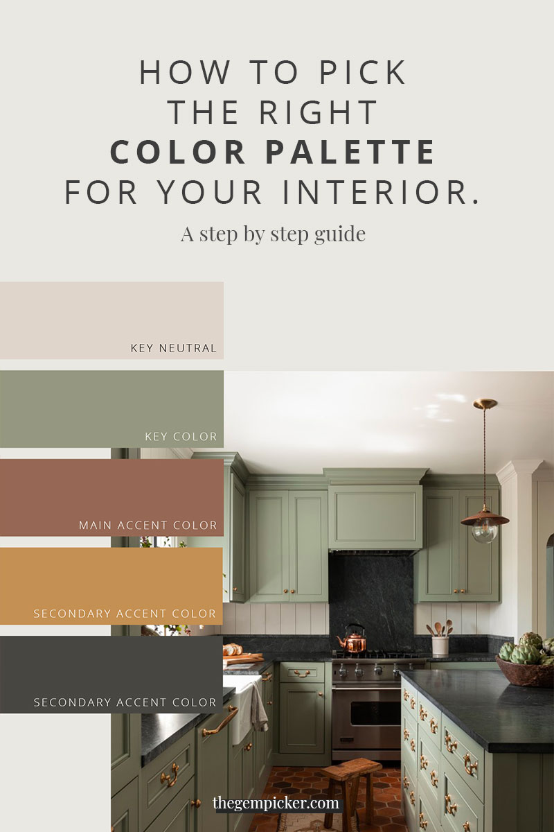


[…] natural, muted tones of Scandinavian design with the subtle, earthy hues of Japanese design. The color palette is typically subdued, with a focus on whites, grays, and earthy tones. Here are some of the colors […]
[…] spaces. Picking a cohesive color palette is one of the most important things when designing a room. (Find out how to pick the right color palette for your interior here). It will create patterns and hence help your eye “read the […]
[…] Featured photo – The Gem Picker […]